Almost ten years ago, we were approached by Simply Plumbing Solutions to create their branding. In 2015, as the company expanded, we designed a complimentary but unique brand for Simply Bathroom Solutions – their showroom. Both brands are a brilliant example of keeping things consistent and professional yet simple for customers – and we love the fact that we have been working with them so long, Marcomedia has also evolved alongside them!
The background
Simply Plumbing Solutions (SPS) was formed in 2006 to offer local customers great quality plumbing products and excellent service at highly competitive prices (thanks to over 20 years’ plumbing experience). SPS’s reputation grew nationally in ways they could never have predicted thanks to their commitment to superior service and they soon became a leading plumbers’ merchants for the UK. In 2015, a new showroom, Simply Bathroom Solutions, was opened so both trade and end-users could come and view their range of bathroom plumbing products and get expert advice.
The brief
The SPS team initially approached us wanting an instantly recognisable, simple but professional brand that people would immediately associate with their trade and their superior service. They needed branding that would look great in all sorts of formats – from sales receipts and credit application forms to business cards and large format advertising.
The solutions
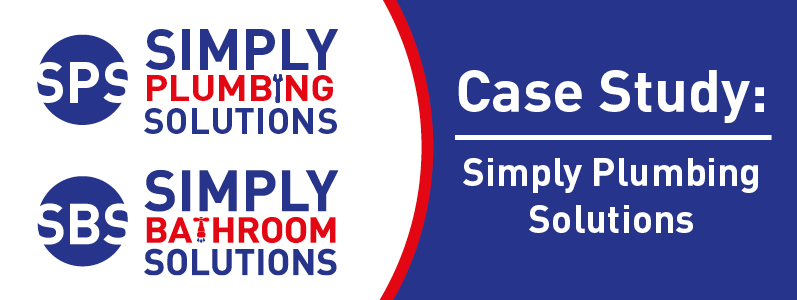
We went with distinctive traditional colours of blue, red and white which were both bold and professional. Blue and white are associated with water and plumbing but we chose a muted blue to give the logo a corporate feel. The red adds a bold element. We created a logo which could be used alone or with the typographic logo which replaces the ‘I’ in plumbing with a spanner symbol so that people will immediately associate the logo with their trade. For the Simply Bathroom Solutions branding we re-used the now well-known branding colours and logo design so people would instantly connect the two brands – and we created a tap icon for the ‘T’ in bathrooms. This adds a fun element and immediately creates a visual association with their services.
The results
SPS and SBS are fantastic examples of a trade organisation getting their branding spot-on. The designs work on all print formats – from paperwork, business cards, large format signage and banners – all of which we have been able to supply them with. We have helped them to ensure that everything is consistent so that clients are left with no doubt that they are dealing with a firm who pays attention to the details. From the way their reputation has grown it is clear that they are a firm who gets things right – and we are pleased that this includes their brand identity.
Whether you are an established company like SPS, or just starting out like they were back when we first began working together, we can help you create the right impression both now and for the future. When it comes to a variety of marketing materials, we will offer you the most competitive print quotes around. Call us on 0208 590 0922 or email us at info@marcomedia.co.uk and lets get those ideas flowing!