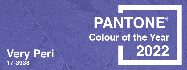
… Peri. Yup. Very Peri (or PANTONE 17-3938 to give it its less-catchy title) has been announced by the Pantone Colour Institute as the 2022 Colour of the Year. And it’s blue, Jim, but not as we know it. Here’s our guide to this blue tone with a twist and how to use it…
Why Very Peri?
As always, Pantone has chosen the colour of the year as a sign of the times. Described as a colour ‘whose courageous presence encourages personal inventiveness and creativity,’ Very Peri is a blue with violet-red undertones. With nods to the pandemic and wider global issues, it is described as being, ‘inquisitive and intriguing’ as well as ‘opening us up to a new vision as we rewrite our lives. Rekindling gratitude for some of the qualities that blue represents complemented by a new perspective that resonates today, PANTONE 17-3938 Very Peri places the future ahead in a new light.’
A colour for a more digital era
Pantone describes Very Peri as having links to our increasingly digital world, “As we emerge from an intense period of isolation, our notions and standards are changing, and our physical and digital lives have merged in new ways. Digital design helps us to stretch the limits of reality, opening the door to a dynamic virtual world where we can explore and create new colour possibilities. With trends in gaming, the expanding popularity of the metaverse and rising artistic community in the digital space PANTONE 17-3938 Very Peri illustrates the fusion of modern life and how colour trends in the digital world are being manifested in the physical world and vice versa.”
A new colour for a new world?
This is the first time that Pantone has created a new colour and Leatrice Eiseman, Executive Director, said of it, “As we move into a world of unprecedented change […] Very Peri brings a novel perspective and vision […], encompassing the [trusted] qualities of blues yet at the same time […] a spritely, joyous attitude and dynamic presence […].”
How to use Very Peri
Pantone have produced a number of colour palettes to inspire and show the versatility of the 2022 colour of the year. Among them are balanced warm and cool hues, natural tones, classics and neutrals and a palette called Amusements with ‘joyous and whimsical tones.’ So Very Peri can be integrated into anyone’s design, print and web – whether your brand is classic and traditional or young and fun – or even a bit of both!
When it comes to colours, it’s always about what works for you and your brand rather than what the latest trend is. We hope that this blog has inspired you to inject a little more colour into 2022 and we’d love to help you with that whether it’s in your design, print or web campaigns! Talk to us on 0208 590 0922 or email us at info@marcomedia.co.uk Here’s to a Very happy new year.