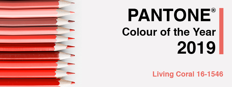
If you haven’t already heard, the colour on everyone’s lips (and nails and hair and marketing materials) in 2019 is … coral! Pantone, the internationally-recognised colour matching system, has announced its colour of the year. And this year it makes an unexpected departure from 2018’s futuristic ultra violet or 2017’s calming green by going for the fun and retro ‘Living Coral’.
What does coral mean to you?
Pantone has described ‘Living Coral’ as “an animating and life-affirming coral hue with a golden undertone that energises and enlivens with a softer edge,” and adds that the shade is “sociable and spirited, the engaging nature of Pantone 16-1546 Living Coral welcomes and encourages lighthearted activity.”
We thought we’d ask each of our team of creatives what they personally associated with the colour or how they might use it. Take it away, Team Marco!
Surinder, Creative Director and MD: For some reason, Coral makes me think of the fashions and advertising styles of the 1980s. The trend for simplified and nostalgic retro-themed branding continues to be popular and this would be a great colour for young, fun brands and start-ups, particularly if used with a typographic logo.
Jon, Projects Director: This colour transports me to somewhere tropical, probably with my golf clubs. It would work well for our travel clients obviously but also businesses in leisure, health, fitness and hospitality in general would be able to create some very effective design, print and web using this colour.
Anushiya, Senior Web Developer: There is a strong trend at the moment for websites that are black and white with just a pop of one colour so I think this would work well for anyone who likes that monochrome/pop-art look.
Jamie, Graphics and Web Designer: Coral makes me think of fun and summer days. Brights can be very versatile when muted with darker and more neutral tones and I think this would work really well for a firm that wants to appeal to corporate clients but also wants to convey that they are a little different and forward-thinking.
Layla, Junior Graphic Designer: I think coral works well on seasonal marketing, such as Mother’s Day, Easter or Summer events. But sometimes eye-catching design is about doing the unexpected, so sending out a print campaign with a tropical look in winter can be surprisingly effective because no one else will be doing it.
Veli, Web Support: Updating tired branding doesn’t always mean a complete overhaul. I’ve seen our designers make the smallest of tweaks – such changing a colour or simplifying a design – and it completely refreshes the clients’ logo. A touch of coral would be a great way to breathe new life into a brand for the New Year.
It doesn’t have to be coral!
Obviously we have taken the coral theme and run with it here. But all of the advice and tips from our team applies whatever your colour preferences. If you want to freshen up your branding, launch a new campaign or website, or simply try a new design, print and web supplier in 2019, we are full of ideas! Call us on 0208 590 0922 or email us at info@marcomedia.co.uk