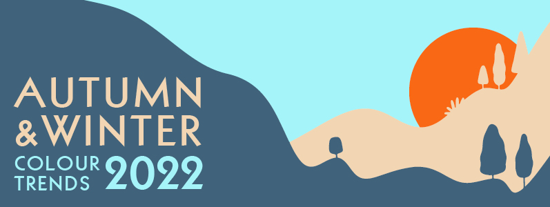
As most of us begin planning our Autumn/Winter 2022/23 marketing campaigns, we thought it would be useful to take a look at the colour trends we can expect to see next season. Pantone has produced its annual guide to the colours of the Autumn/Winter New York Fashion Week so here’s a sneak peek and some inspiration how you might use them in your design, print and web campaigns over the coming months…
Calm and comfort vs vibrant and alive
According to Pantone the New York Fashion Week palette has been inspired by our contradictory feelings about this coming Autumn/Winter – on the one hand we’re looking for calm and comfort as we go into hibernation mode but on the other hand, we’re still wanting to embrace the joy of being alive. The palette therefore marries calming core tones with bright and exuberant colour.
Leatrice Eiseman, Executive Director of the Pantone Colour Institute said, “Colours for Autumn/Winter 2022/2023 contrast our competing desires for calm and comfort with energy boosting vitality through a range of restful and restorative colours, in tandem with exuberant tones. As we move forward into an environment filled with contradiction, hues for Autumn/Winter 2022/2023 enable consumers to move fluidly between a range of contrasting shades, allowing them to spontaneously express who they are and how they feel on any given day.”
Big Brights
The bright colours in the Autumn/Winter palette and their descriptions are:
- Lava Falls – an impassioned orange red with a captivating presence
- Samoan Sun – a pale gold that enlightens and illuminates
- Orange Tiger – a whimsical high vis orange
- Rose Violet – a vivid and vibrant rose full of zing
- Amazon – a lush broadleaf green
It’s possible that we’re all just *so over* Winters after the last few we’ve had so why not keep the Summer vibes going, at least in our design? There’s no rule that says Winter colours need to be dreary. Brights work great for young, fun brands or established brands wanting to inject a little dynamism into their marketing. You don’t have to use the entire palette, just a pop of colour can make all the difference to your brand or design.
Calm and comfort
The calm and comforting colours you can expect to see more of in the coming months include:
- Nosegay – a floral pink that envelops the senses
- Waterspout – a cool and refreshing pale blue
- Caramel Café – a delicious brown hue that tastefully tempts
- Midnight – a hypnotic deep blue evocative of the evening sky
- Martini Olive – a fruit inspired green tone with a touch of brine
These colours have been picked because they work brilliantly with the brights but also each of them can standalone and are eye-catching in their own right. They are calming and comforting but a little different to traditional Winter and Autumn colours. Autumn and Winter are FULL of seasonal marketing opportunities (think: Diwali, fireworks, Halloween, Movember – to name just a few!) and these colours would enable you to run a traditional campaign but with a trend-setting twist.
The Core Classics Palette
As always, Pantone has off-set the seasonal colours with a palette of ‘Core classic’ colours which are:
- Arctic Wolf – a softly shaded tactile white
- Autumn Blonde – a creamy, nurturing blonde tone
- Polar night – a cosmically inspired blue hue
- Loden Frost – an earth infused green tone that calms and restores
- Chiseled stone – a stone grey displaying silent strength
Again, these can be used in conjunction with the other colours to temper them or alone to create soothing designs that appeal to the hibernator in all of us.
As we always say when we write blogs on trends, these are just to provide inspiration. Don’t feel you have to follow the crowd – the best designs are the ones that are best for you, reflecting your unique business and brand values. We love a trend-setter here so whether this blog has inspired you to play with colour in your next design, print or web campaign or whether you have other ideas, we’d love to hear from you! Call us 0208 590 0922 or email us at info@marcomedia.co.uk