Well, colour us just a tiny bit smug as Pantone announces the colour of the year, hot-on-the-heels of our last blog in which we got our predictions right! Here’s a little more about the colour you’ll be seeing a lot more of next year, how we spotted the trend and how you can use it in your own marketing …
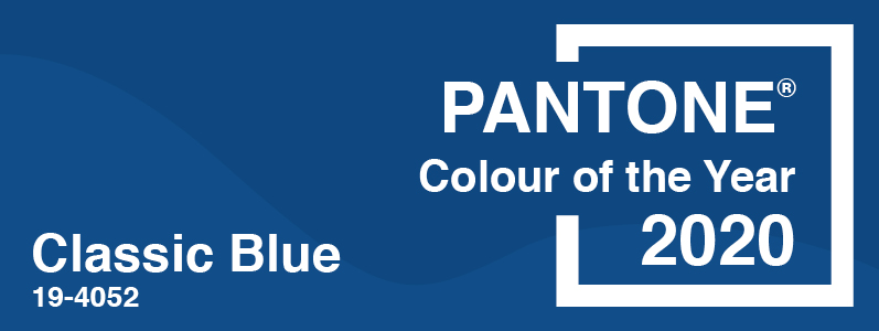
Classic Blue
Pantone describes Classic Blue as “instilling calm, confidence, and connection, this enduring blue hue highlights our desire for a dependable and stable foundation on which to build as we cross the threshold into a new era”. Not only did your friendly Marcomedia team predict a coastal colour (although we thought they would go with something paler), we rightly predicted that Pantone would choose something calming as an antidote to a year of change. And, yes, we are still a bit smug about getting it right …
Singing the blues
Classic Blue is a colour that we already use for clients in the corporate, legal and financial sectors because of its association with traditional values and professional feel. Did we mention we are often ahead of the game? OK, we’ll stop being annoyingly smug now. But this sort of tone can also work really well alongside vibrant colours – especially for brands who are both young, fun and unique but also experienced and specialist. Big bold typography and retro icons aren’t going anywhere any time soon and classic colours work brilliantly with these too.
But what is your colour of the year?
Choosing the right colours isn’t just about following trends, it’s about what those colours mean to your industry and to you. And January isn’t just the start of a new year, it’s the start of a new era. Imagine going into 2020 with a new look, a new marketing campaign or a new website. Whatever your plans, we’d love to hear them and help you realise your 2020 vision! Call us today on 0208 590 0922 or email us at info@marcomedia.co.uk