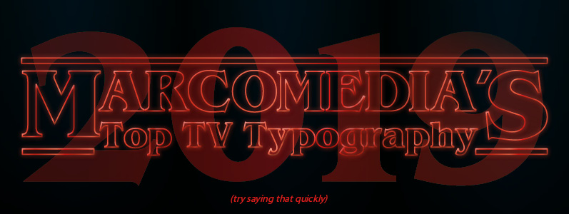
With so many different networks and streaming providers to choose from, TV shows these days not only need to be ‘binge worthy’ to capture the interest of the public, but a slick brand in themselves – including the use of iconic typography. Even though we are only halfway through the year at the time of writing, 2019 has already offered us some brilliant series which have got people talking about typography. Here are our favourites so far …
Stranger Things
OK, so it hasn’t actually happened at the time of writing but we all know that season three is going to be awesome. If you haven’t already, check out the trailer, and you’ll know too. Stranger Things was arguably the first TV show in recent history to make typography a star of the show. The famous font is inspired by 1980s novels, and in particular the novels of Stephen King. The iconic typeface and red glow, which has been described as like an eerie 1980s motel sign, has become as important to fans as the characters and plot itself. When we work with clients, we aim to produce branding which is instantly recognisable and will resonate with their target market as well as their own preferences.
Killing Eve
This is a beautiful example of animated typography. Much like the characters and plot itself, it is loveably cool in its boldness, but the hint of a weapon in many of the letters is both playful and threatening. Killing Eve takes typography-as-star-of-show a little further, with it popping up to announce locations, reinforcing the 1970s/80s retro spy/thriller feel of the show. Continuity is something which is important to us too – we will ensure that your branding is consistent across all your profiles, channels and materials so that it tells the story you want the world to know.
Russian Doll
The critically-acclaimed collaborative writing and directorial debut from Orange is the New Black’s Natasha Lyonne, uses highly distinctive typography that combines the retro and literary influences of both Killing Eve and Stranger Things. The Russian Doll typeface is distinctive and once again takes from the 1970s and 1980s. It is bold and hints at something dark and unusual but is modern in its simplicity. We think the fact that three of the most popular shows of this year have used what we have decided to call ‘retro literary’ typography suggests a trend and we wonder whether this will transition to the commercial arena in a more muted form.
Good Omens
Finally, Neil Gaiman and Terry Pratchett’s much anticipated limited series has been met with huge acclaim and the odd controversy. The typography used for Good Omens is a brilliant example of a typographic logo, pulling in elements of the show itself, much like Killing Eve. But with Good Omens, rather than a sense of menace, there is a sense of fun and fantasy: the ‘o’ in ‘good’ wearing a halo and the ‘M’ in ‘omens’ having a forked tail. The uneven and shaky style of lettering hints at magic and ancient legends. We have created many typographic logos over the years hat we are really proud of – from those for photographers to physiotherapists.
Here at Marco HQ we find design, print and web inspiration everywhere – even when watching the TV! If our TV-geek-fest blog has inspired you to go with a bold new brand, or you just need some iconic ideas for your latest marketing campaign, call our creative team on 0208 590 0922 or email us at info@marcomedia.co.uk We’ll make you the legendary star of your own epic show!

