Ready for Spring? Spring always comes early here at Marco HQ because we are working on design. print and web for Spring, Summer and beyond. So, whatever the weather, put yourself in a Spring mood by letting us guide you through the colour trends of the new season and how you could use them…
Paris, London, Milan, Newham
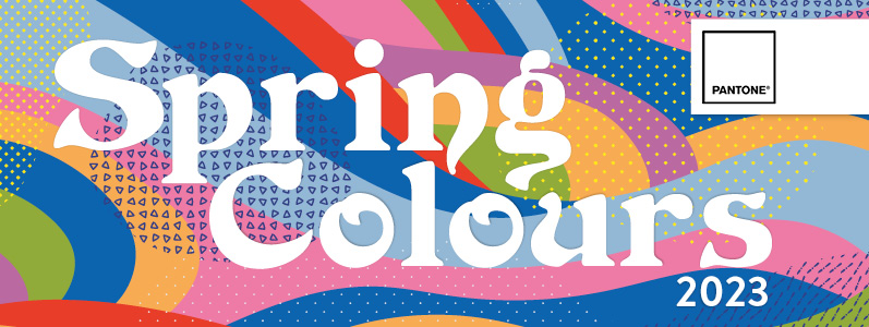
The “official” Spring/Summer palette comes from London Fashion Week via Pantone (the colour institute which sets the official colours of the year). Design trends often follow fashion and Pantone has taken the key colours seen on the catwalks and turned them into a range of Spring/Summer shades to inspire. But you don’t have to be a trend-follower, you can always be a trend-setter and the colours of nature blossoming may be all the inspiration you need.
Energy, vibrancy, comfort and calm
This season’s collection of colours are described by Pantone as “a palette that blends our need for high-spirited energy and dynamic vibrancy with colours that comfort and provide a calm space.”
Leatrice Eiseman, Executive Director of the Pantone Color Institute, said, “As we anticipate our future, we are embracing the freedom to colourfully express our individuality without constraint. Experiencing a creative liberation that transgresses previous norms, we are adapting and inventing novel pairings and contrasting harmonies.”
The colours you can expect to see this Spring/Summer
So, without further ado, the colours Pantone predicts we will be wearing and designing with this summer are:
- Cherry Tomato – a vibrant red
- Persimmon – a muted coral
- Iced mango – a tropical orange
- Blazing yellow – a sunny yellow
- Titanite – a yellow green
- Andean toucan – an exotic green
- Airy blue – a sky blue
- Electric blue lemonade – a brilliant blue
- Spring Crocus – a floral purple
- Pink Cosmos – a contrasting pink
Core classics
In addition to the colours, Pantone have announced a palette of ‘core classics’ to be used in combination or alone. These colours are calming and soothing:
- Oyster mushroom – a subtle grey
- Grayed jade – a grey green
- Tender peach – a pale peach
- Mocha mousse – a chocolate brown
- Bluing – an inky blue
So how could you use them?
These colours are so versatile that any brand could use them in
- Digital advertising
- Branded social media images
- Emailers and newsletters
- Print campaigns
- Banners and signage
- Landing pages
- And more…
Or you may like them so much they inspire you to refresh your branding and put a real spring in your step!
As we always say, trends are really just inspiration and you don’t have to follow them – in fact, we love a trend-setter! The most important thing is using colour which is right for your brand. So, give our team a call on 0208 590 0922 or email us at info@marcomedia.co.uk and watch us spring into action.